Project Brief
As part of an interface design challenge in the Bootcamp, we had to identify the unemployment insurance website of Nevada.
To research the key users, identify their pain points, and propose solutions for an alternate experience.
The Proposal
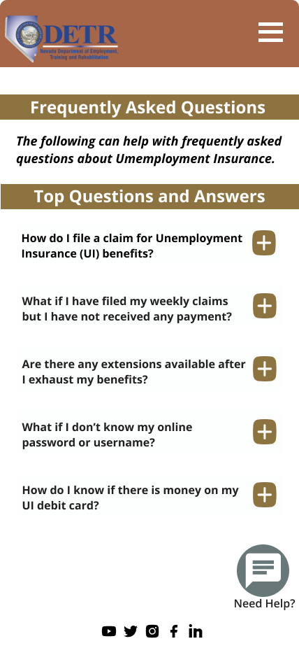
The proposal aims to re-design a more straightforward website for users to complete their tasks without frustration.
Easy to follow instructions, instant help buttons, and engaging information to assist our users in what they need.
Team: Group of 4 members
Responsibilities: Content Auditing, User Research, Information Architecture, Sitemap, Style Guide, Wire-framing, Interactive Prototyping (on desktop and mobile)
Duration: 5 weeks
Tools: Figma, Google Sheets
The Challenge
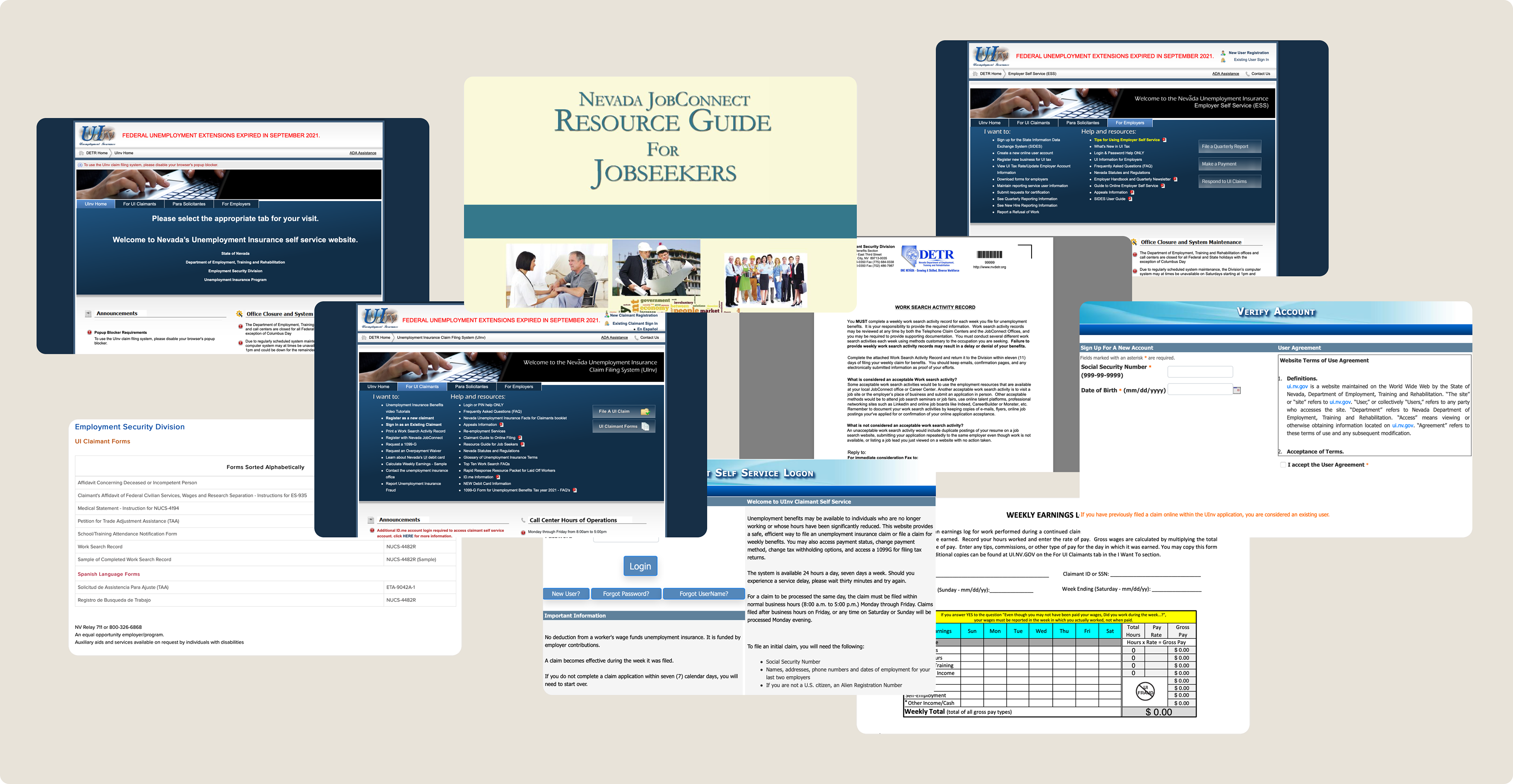
As observed at the time, the existing website has overwhelming information presented in listed links, where it redirects to lengthy PDF file or text documents. Locating the correct information to complete a task on the platform was time-consuming, and discouraging.
Applying for unemployment benefits and getting back to the workforce should be encouraging, and have an overall positive experience. The platform has presented extensive information to assist users, but sentiment was lost in the way how the contents were presented.
Informative platform loaded with unnecessary and repetitive contents.
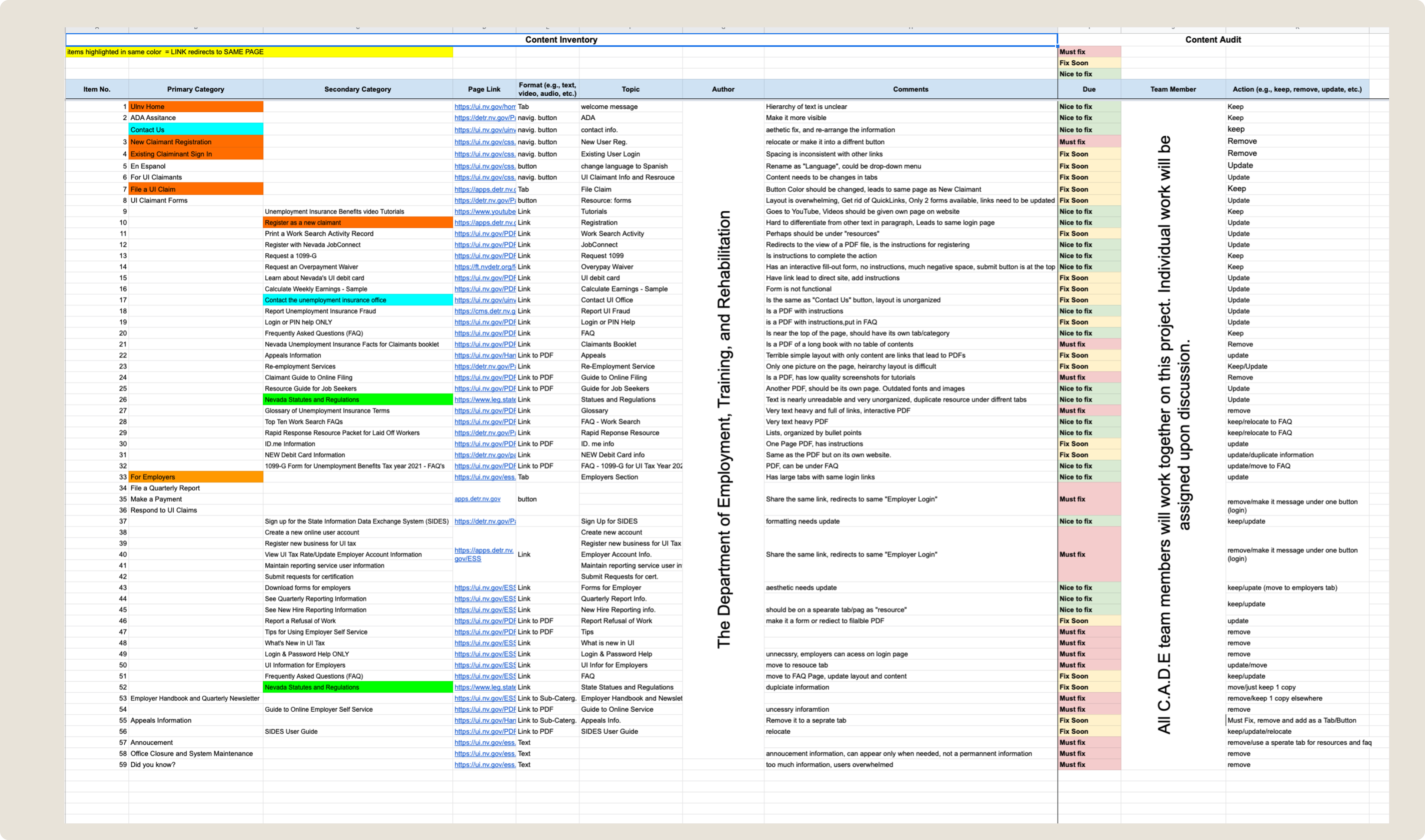
Identifying pain-points in the current website
To fully understand the current platform, every piece of information is recorded and ranked in the form of an excel sheet, followed by content auditing to decided which contents needs immediate fix.
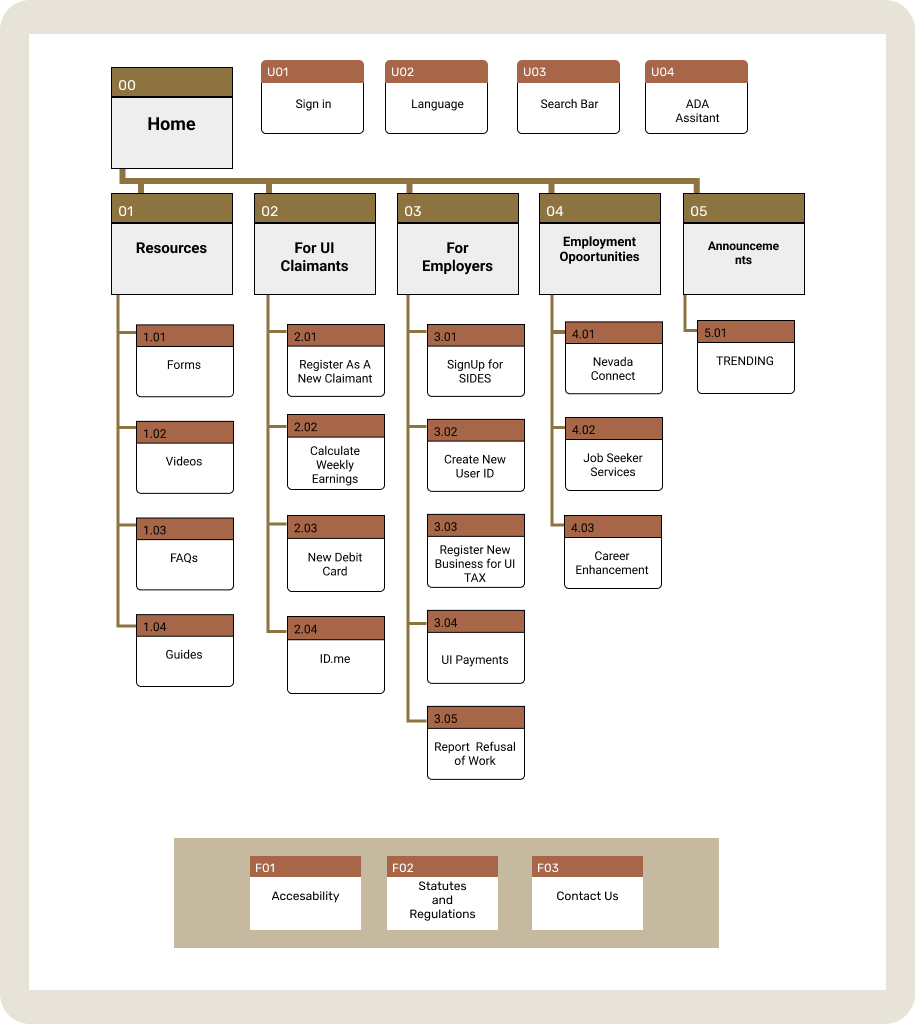
Information Architecture
and Site-Map
Referring back to the content inventory and content audit, information were re-evaluated and organized to build a new site-map.
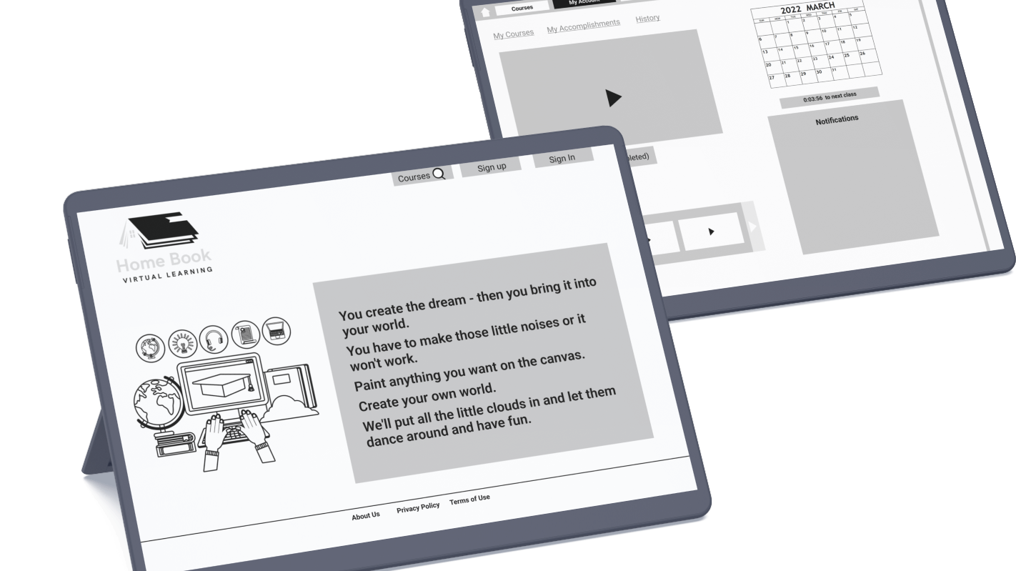
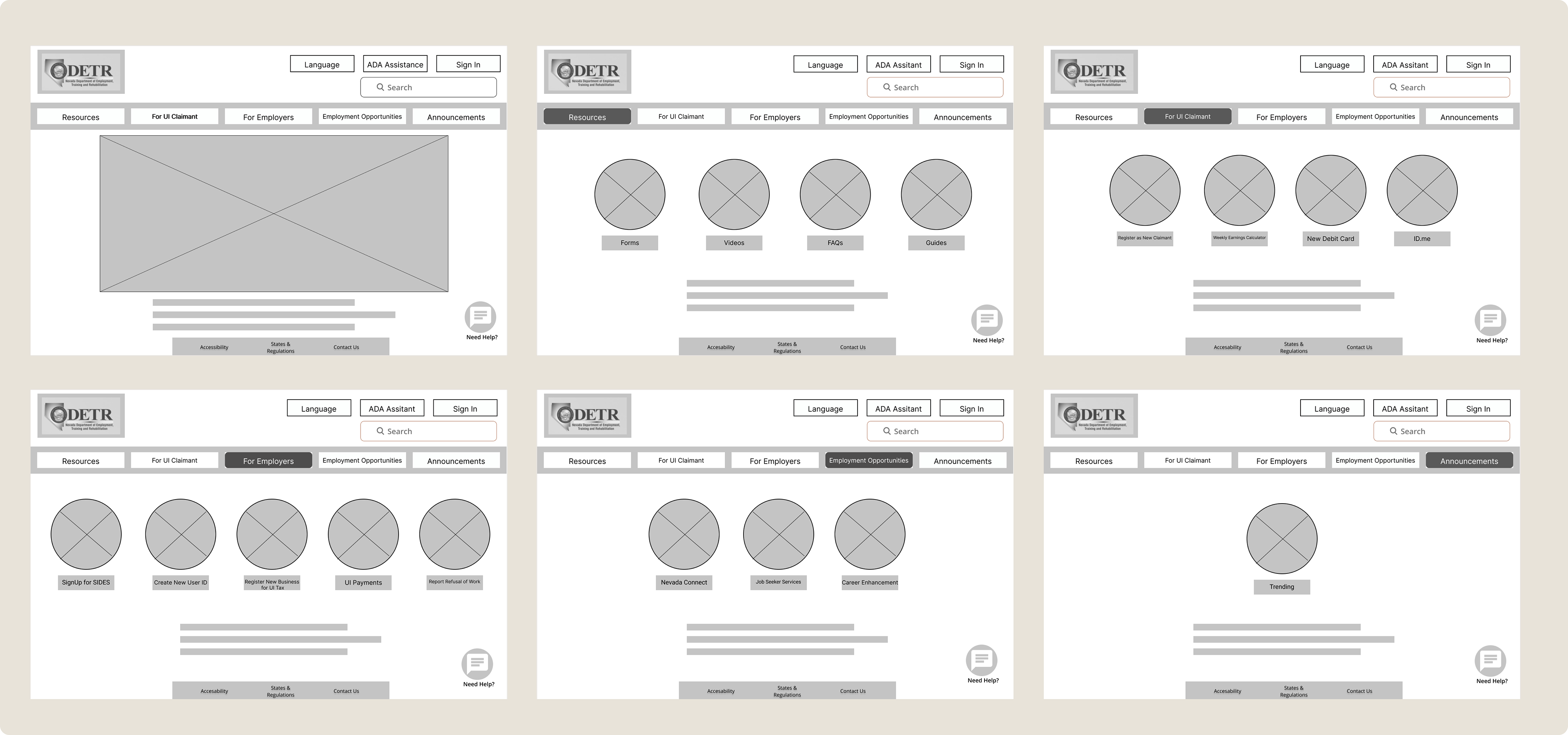
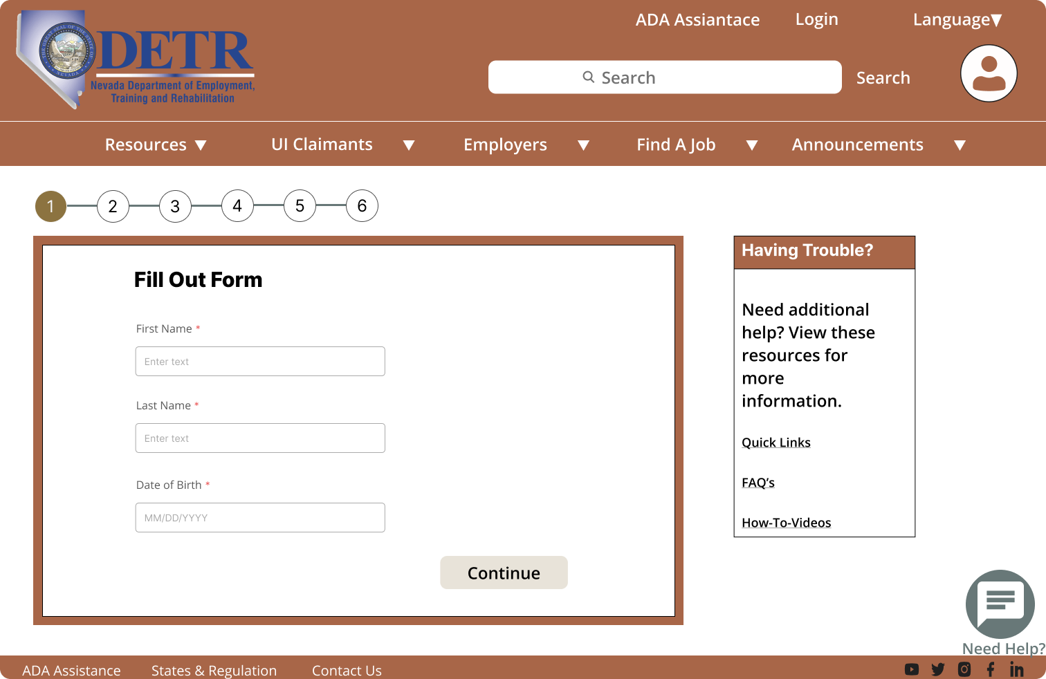
Wire-Framing
Created based on the new site map with added features to enhance user experience.
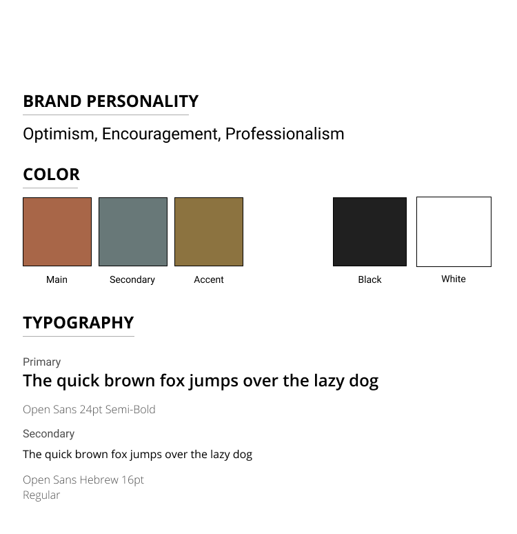
Style Guide
Color for the re-designed platform were visualized by a trip to Nevada state. The colors symbolizes optimism, professionalism and encouragement, they are true Nevada neutral colors that are familiar to their residents.
All three colors passed the color accessibility ratio testing against both light and dark backgrounds.
Typefaces are modern and legible, both offers excellent reading experience, optimized for various interfaces.
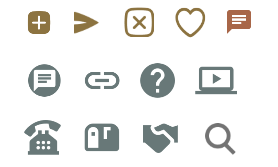
Microelements
Easy and recognizable icons to better communicate for the user interfaces, provides necessary information by visual means.
High-Fidelity Wireframes
Applying visuals and adding helpful features to promote positive user experience.
Key points
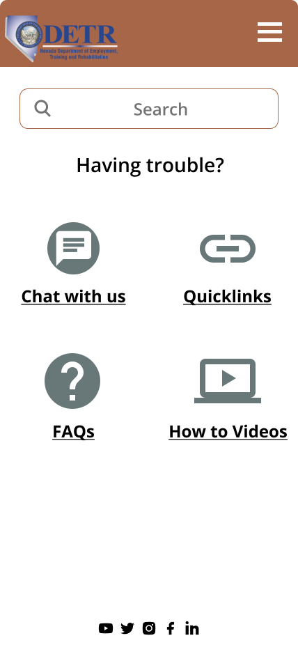
- Virtual chatting for immediate assistance
- Search option to find the necessary information
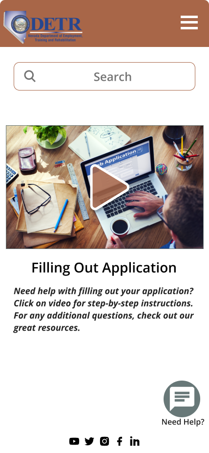
- Instructional videos to walk-through application process
- Concise information for quick reference
- Job postings to encourage users
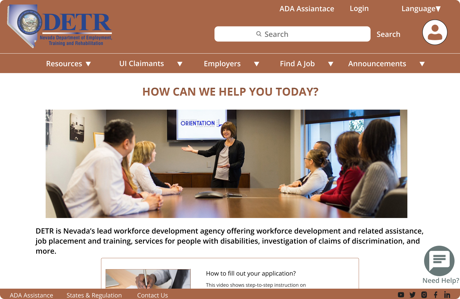
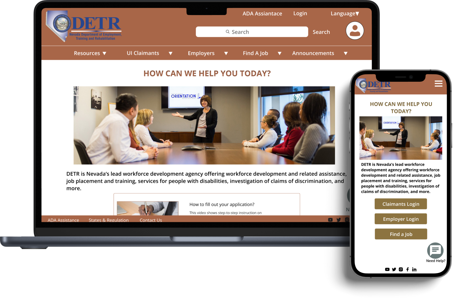
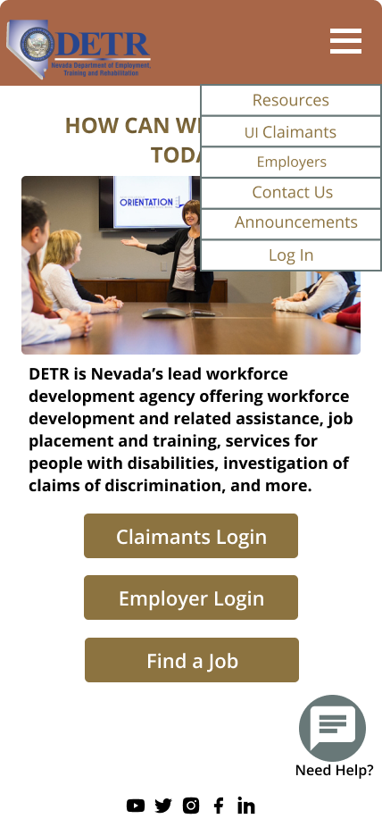
Landing Page
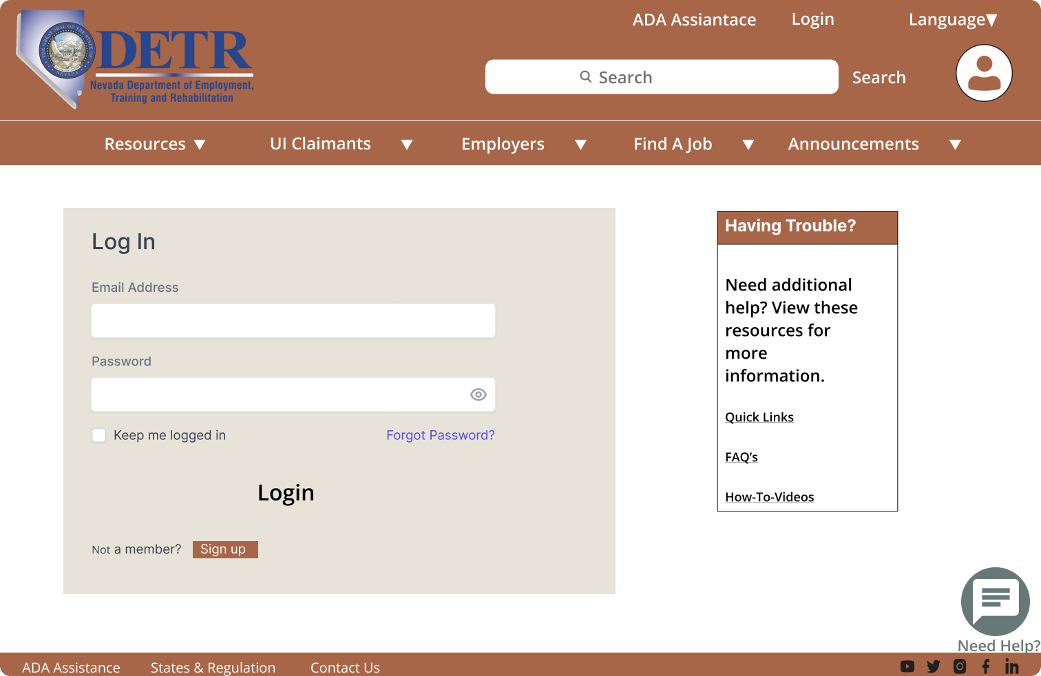
Login Page
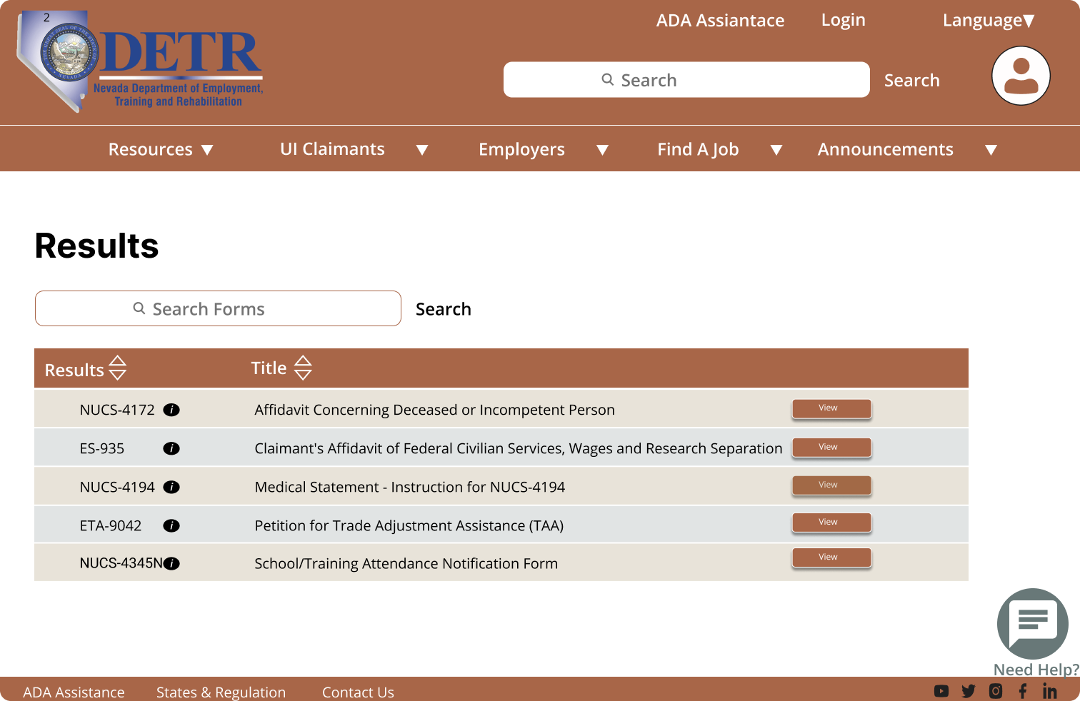
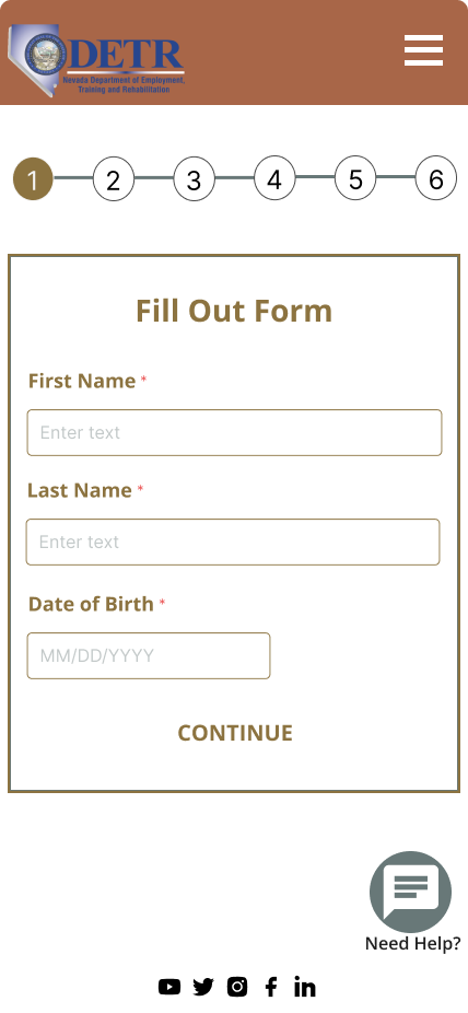
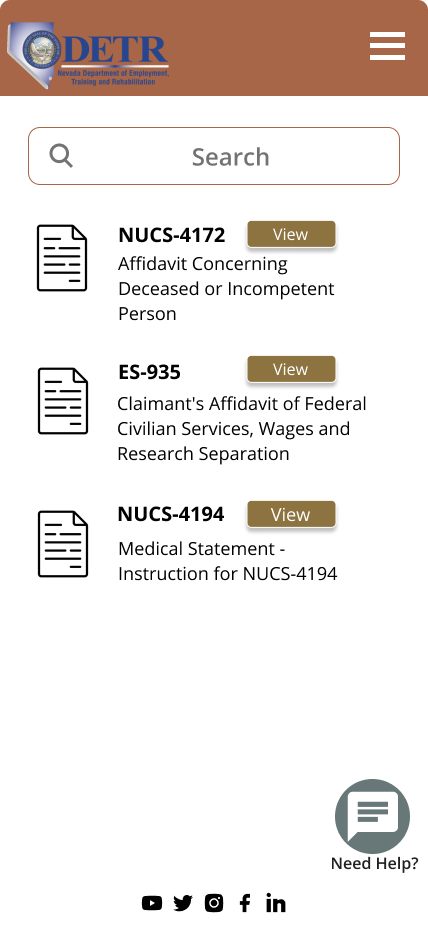
Resources Forms
Sign up process
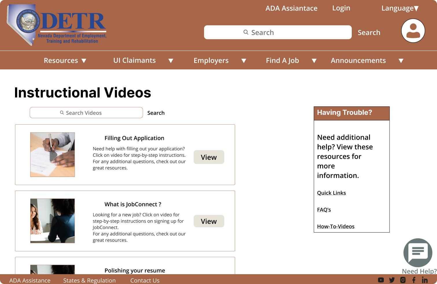
Instructional Videos
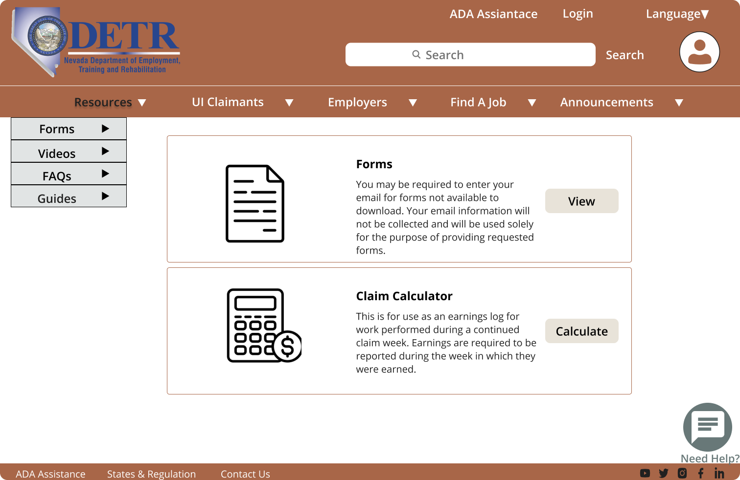
Resources Tools
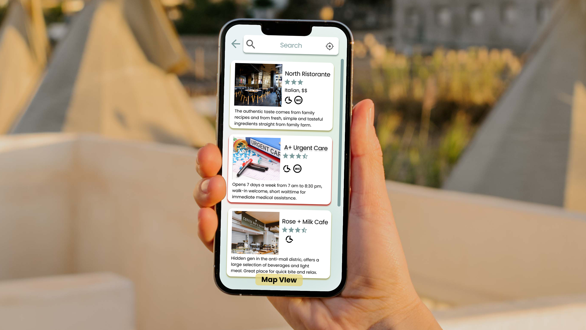
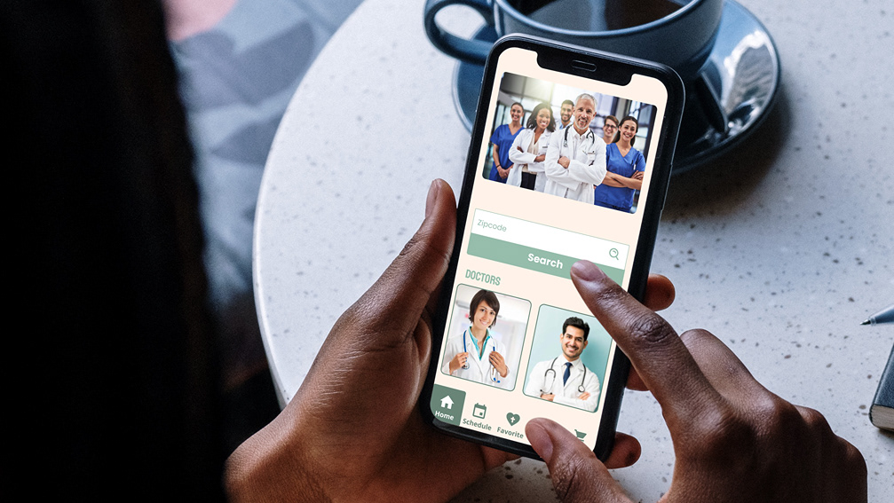
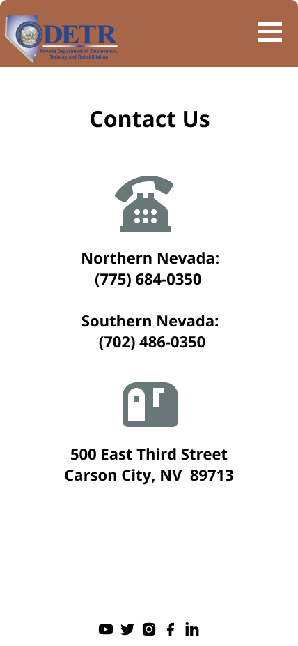
Mobile App
The benefits of having a mobile app are reliable and convenient, users can check their status update or look for resourceful information at anytime.
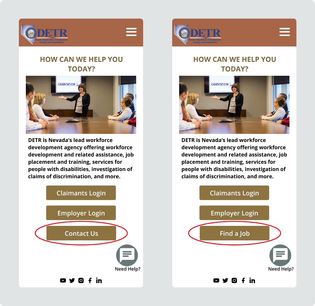
A/B Testing
To make the mobile app as convenient as possible, we made variations and testing plans.
The results were 95% testing users prefer to have Find a Job button on the homepage.
Mobile App Wireframes
With a focus on checking status progress, job postings and other resourceful tools. The launch of Nevada Unemployment Benefits mobile app will be convenient, easy to use, and bring encouragement to users.
Highlights
- Easy to locate Login buttons
- Up-to-date Job postings
-Resourceful informations


Reflection
Our team spent enormous time on auditing the contents and information architecture, tried our best to redesign a brief but comprehensive webpage. The goal was to keep the most used features on the navigation page, and created useful tools including the Chat Box and Search Option for quick and convenient assistance, interviewed users before and after A/B Testing to gather more research data, and keep iterating until we finalized the site.
Although this is only a case study on the Unemployment Insurance webpage, our team redesigned it as a real project, we truly empathized with the residents who became unemployed during difficult.